01
portfolio
Canadian Tire Corporation / 2022 - ongoing
Design System
User Interface
User Experience

ABOUT PROJECT
As part of Canadian Tire’s enterprise digital transformation, I contributed to the evolution of One Digital Platform (ODP) a centralized ecosystem designed to unify digital experiences across the company’s portfolio of brands. The initiative aimed to replace fragmented design practices with a shared foundation that enabled teams to build consistent, scalable, and accessible digital products while accelerating delivery across websites and applications.
The Design System became the cornerstone of this transformation, providing a single source of truth for reusable components, design standards, and governance. Built to support an Adobe Experience Manager (AEM) ecosystem, it empowered multiple product teams to create cohesive customer experiences while maintaining the flexibility required by each brand.
Challenge
When our team assumed ownership of the project, the Design System had been initially developed by an external partner in Adobe XD format. While it established a good foundation, it lacked the scalability, maintainability, and collaborative workflows needed to support a growing enterprise ecosystem.
One of our first priorities was to migrate the entire system to Figma, rebuilding components using modern design system best practices and leveraging variables, component properties, auto layout, and reusable patterns. Beyond the migration, we expanded the system with new components, refined existing patterns, and established a stronger foundation that could evolve alongside the organization’s digital strategy.


My Role
As a Design System Designer, I played a key role in evolving the Design System from a static design library into a scalable product used across multiple teams and brands. My responsibilities included collaborate with the migration from Adobe XD to Figma, rebuilding and optimizing component architecture, designing new reusable components, and continuously improving the system based on product and structure needs.
I collaborated closely with other designers, developers, and cross-functional stakeholders to ensure the system was practical to implement, easy to adopt, and aligned with both user experience standards and business goals. My work helped establish a more efficient design workflow while creating and extending a stronger foundation for future digital products.
Configurable Components
Worked on optimized the Design System by leveraging Figma's component properties, variants, Auto Layout, and text properties to create a scalable single source of truth. This empowered designers to build interfaces more efficiently, reduce repetitive work, and maintain consistency across products while improving collaboration between design and engineering.
Product Carousel Component:
Light and Dark Themes
Supporting Light and Dark modes was a core requirement of the Design System. By creating a flexible theming architecture with reusable color tokens and adaptable components, we enabled product teams to deliver accessible, consistent experiences across brands while minimizing design and development overhead.
Hero Banner Component:

Light Mode
Accessibility Compliance
Accessibility was built into the Design System by default—not added later as a compliance exercise. As one of Canada's largest retail organizations, Canadian Tire is required to comply with Ontario's Accessibility for Ontarians with Disabilities Act (AODA), making WCAG 2.0 Level AA compliance a core business requirement. Every reusable component was designed and validated to meet accessibility standards, including color contrast, keyboard navigation, focus visibility, screen reader compatibility, and readability. By embedding accessibility into the foundation of the system, we enabled product teams to create inclusive, compliant, and consistent experiences by default, reducing accessibility debt while improving scalability across the organization's digital ecosystem.
Connect CMS Image fields (Image 1–10)
Documentation & Governance
A Design System is only as effective as its adoption. To ensure long-term scalability, we established a governance framework that extended beyond components to include comprehensive documentation, detailed playbooks, clear contribution processes, and implementation standards. Using Zeroheight as our centralized documentation hub, we created a single source of truth where designers, engineers and stakeholders could access design principles, accessibility requirements, component guidelines, and implementation best practices. We also defined standardized Figma handoff workflows that streamlined collaboration between design and engineering. This governance model accelerated adoption, reduced inconsistencies across products, improved onboarding, and enabled the Design System to evolve sustainably while maintaining quality, accessibility, and brand consistency across the organization's digital ecosystem.
Connect CMS Image fields (Image 1–10)
Unified Foundation

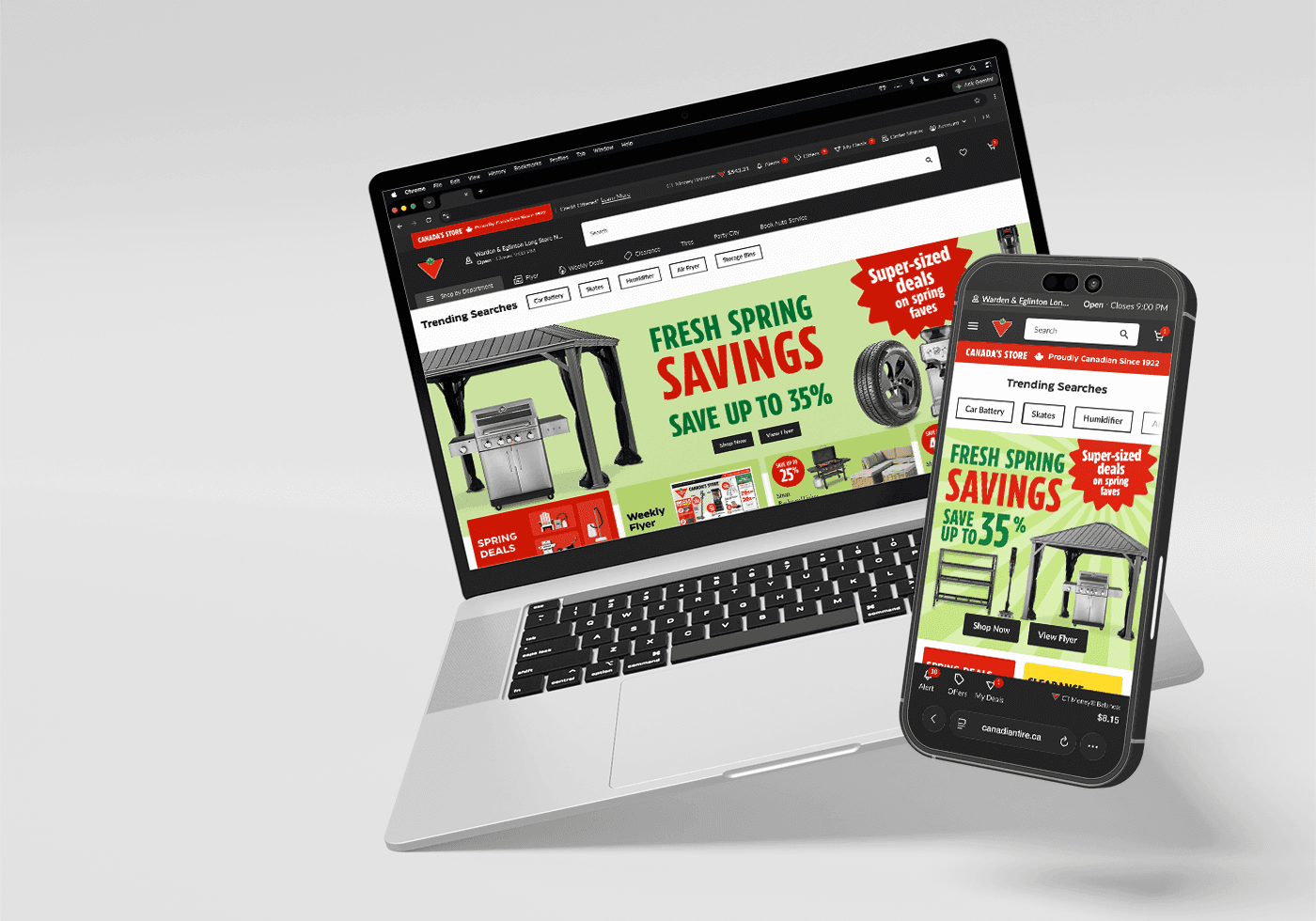
Design Systems are never truly finished, they evolve alongside the products and teams they support. This project was about more than creating reusable components; it was about establishing the processes, governance, accessibility standards, and shared foundations that enable an organization to design at scale.
This Design System had become a mature foundation supporting Canadian Tire's digital ecosystem, and our team had already initiated the vision for an enhanced Design System 3.0. Knowing that the next generation would build upon the framework we established was a meaningful milestone and a testament to the long-term value of designing systems that are built to evolve.
This project reinforced my belief that the success of a Design System is measured not by the number of components it contains, but by its ability to enable teams, improve collaboration, and evolve alongside the products it supports.
02
see more


